Sureshot UI Product Ecosystem
Role
Senior UI/UX Designer
Client
Sureshot
Date
Jan 2019 - October 2020
Brief
Prior to the Sureshot UI and product design effort Sureshot had several products that were highly disconnected. From a UX perspective they had very different interaction patterns and elements. Visually the products shared no similar elements and obviously were built at different times throughout the companies history. Establishing a strong product ecosystem was a primary goal. I approached this problem by understanding our primary users, and aligning the team on their needs. From there I directed and designed a consistent visual language (Sureshot UI) that aligned the products in terms of their visual space and components. This extended throughout the Sureshot product ecosystem (authentication pages, error pages, marketing, etc). As the visual updates were happening I explored the idea of creating shared patterns between the various products. This effort was looking at micro-interactions and shared features, like auto-complete, that could be aligned between the products. Having consistent interactions and unique shared UX allowed customers to switch between Sureshot's products with ease and familiarity.
Case Study
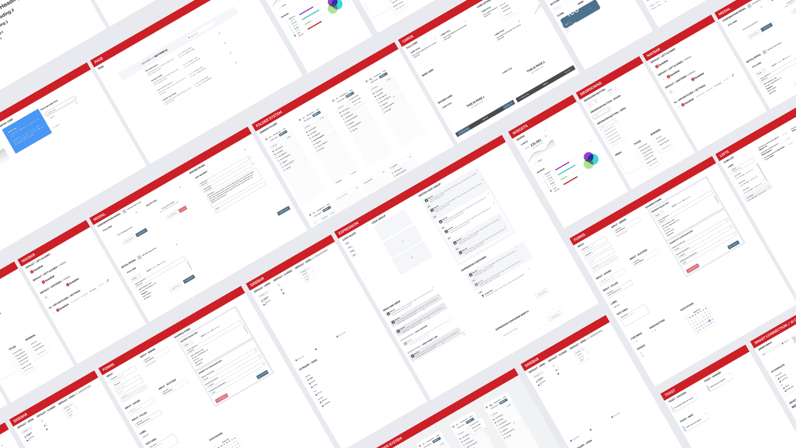
Sureshot UI example components
Simplify, simplify, simplify
The goal for the Sureshot design system (now called Sureshot UI) was to align all of the existing and new products visually and functionally. Sureshot provides many different products and they encourage the customer/user to switch between different products for different needs, similar to how the Google web app suite works. A key part of that business model is keeping users integrated into your products. If your products are not consistent in appearance and functionality it trains the user to be comfortable with switching product ecosystems since they have already gotten used to different visuals and workflows.
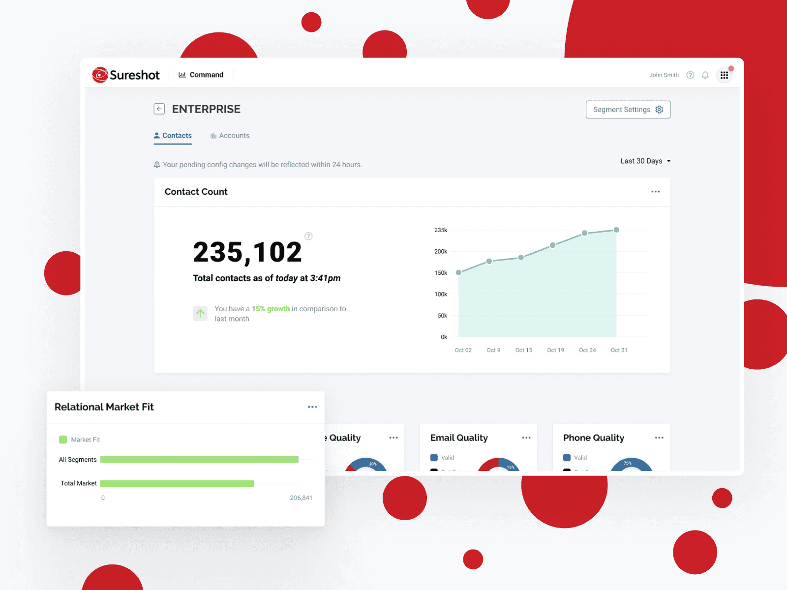
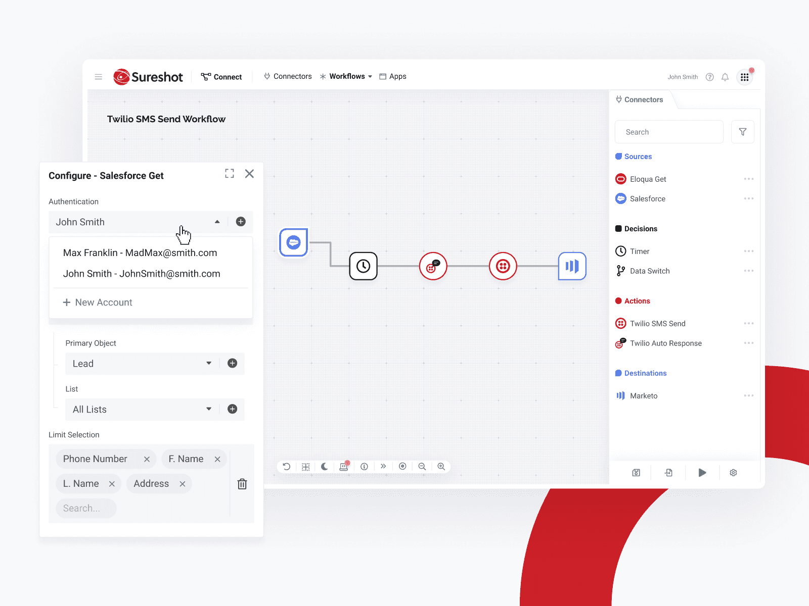
Sureshot Command - Sureshot Connect
Sureshot UI aligned the visual language of the products with well documented UX patterns. This new consistency not only improved the appearance of the applications but also helped define the Sureshot ecosystem of products. Removing the learning curve from each new application the user would visit by sharing consistent UX patterns and visuals keeps the user in the Sureshot world, not jumping between various different platforms and applications.
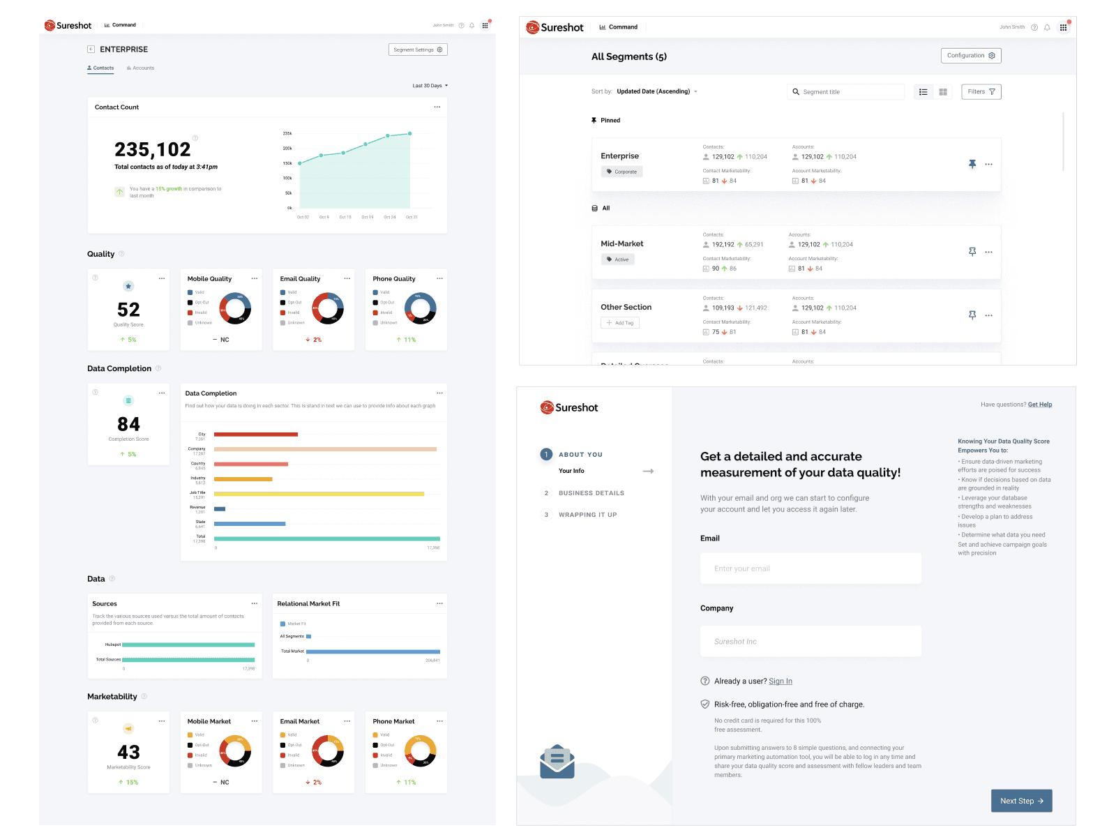
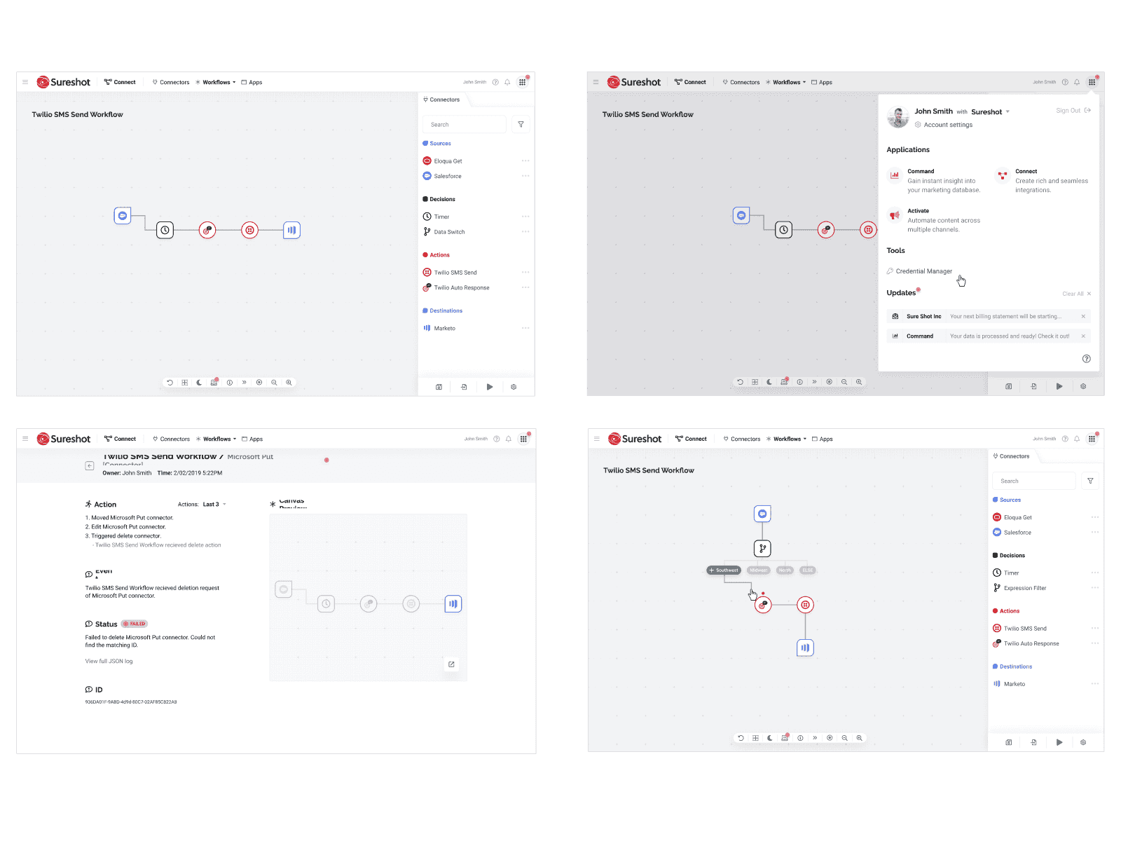
Consistent visual styling
Collaboration
Sureshot UI was built in Figma and utilized the team features of the tool to allow others to collaborate and quickly iterate with the custom modular designs and pre-built layout modules. Everything was built with the latest auto-layout components so designers could quickly iterate and prototype with ease. The library also included "layout modules" which were predefined sections of the UI that shared common elements and patterns. These modules still allowed for customization but helped create a consistent experience between the Sureshot ecosystem.
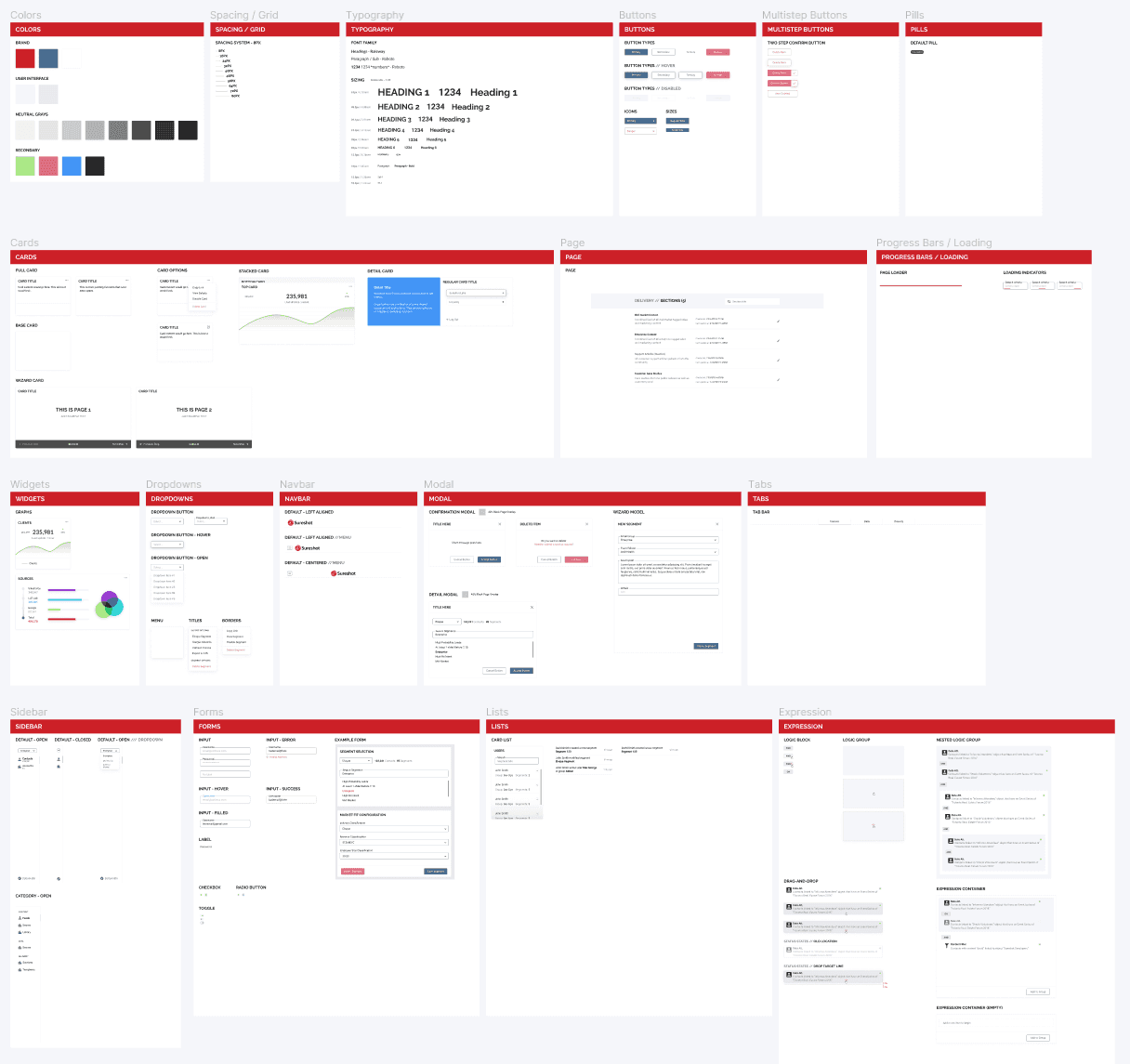
Sureshot UI Figma
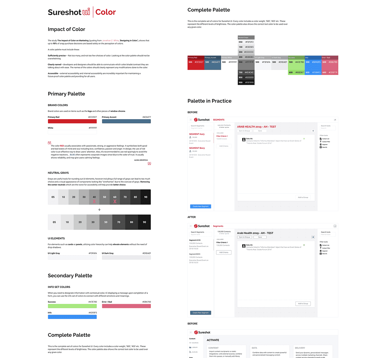
As the design language grew it also become better documented so that the team can reference components for UX guides and usage instructions. This is useful for those who are wanting to make new designs or for developers who are implementing/tweaking components.
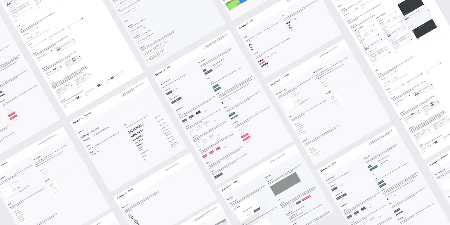
Sureshot UI Figma Documentation
Future-proofing
Part of building a strong design system and product catalog is building applications that will scale. An often overlooked requirement is building well documented products internally with a solid onboarding experience. Sureshot UI was built on the idea that any questions surrounding the library could be solved with resources also provided by the library. Sureshot UI has solid documentation, visual examples, API/prop lists with explanations, and Storybook JS integration.
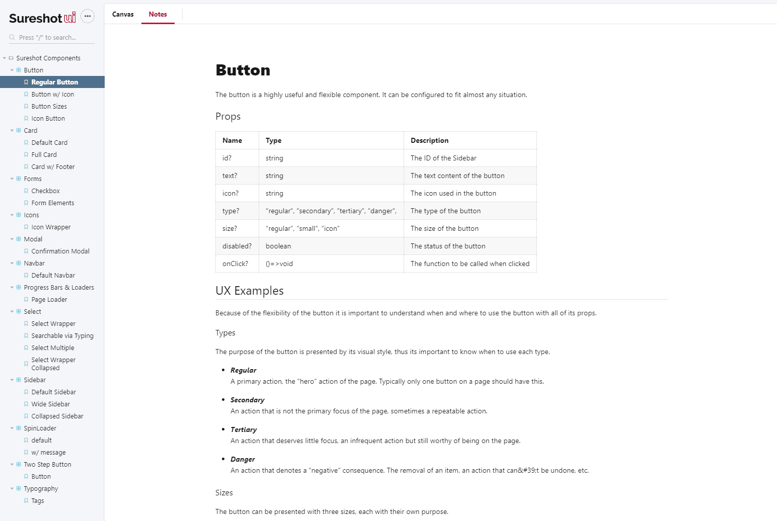
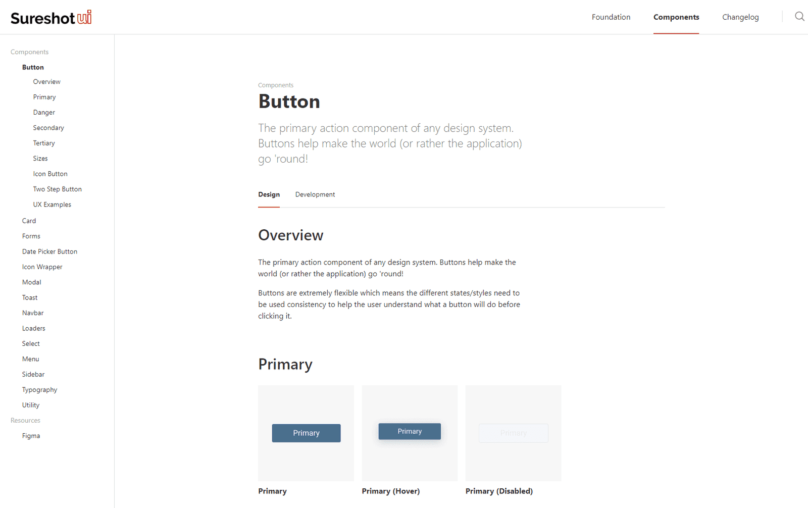
Sureshot UI Dev Documentation Example
Business Outcomes
At the end of this effort Sureshot went from struggling to keep clients from switching to competitor products to easily selling an entire ecosystem to customers. The strong pairing of product design and functionality combined with the compelling nature of staying in a familiar and linked ecosystem increased Sureshot's business revenue and customer retention rates.
